How to Create a Multi-Step Form in WordPress (Free, 2026 Guide)
If you've ever abandoned a long web form halfway through, you already understand why multi-step forms exist. Breaking one long form into a handful of shorter screens — each with a visible progress bar — measurably reduces how many people quit before submitting. This guide covers what a multi-step form actually is, the conversion data behind why they work, how to build one in WordPress without paying for a plugin upgrade, and how the free tiers of the major form plugins compare on multi-step support specifically.
What is a multi-step form?
A multi-step form (also called a multi-page form) splits one form's fields across several screens instead of showing everything on a single page. A visitor fills out step 1, clicks Next, fills out step 2, and so on until a final Review or Submit step. Most implementations show a progress bar or step indicator ("Step 2 of 4") so visitors always know how much is left.
Common real-world uses:
- Lead qualification forms — a few quick questions up front, contact details last
- Event or webinar registration — personal info, then session preferences, then payment
- Job applications — personal details, work history, and document uploads as separate steps
- Grant and funding applications — organization info, project details, budget breakdown, and supporting documents each as their own step, which keeps a genuinely long application from feeling like one overwhelming wall of fields
- Quote or estimate requests — narrowing down what a visitor needs before asking for contact info
- Onboarding and intake forms — SaaS signup flows, client intake for agencies, medical intake forms
Why multi-step forms convert better
This isn't just a design preference — there's real conversion data behind it, and it's worth understanding before you decide whether to bother.
Source: Formstack conversion data, cited across multiple 2026 form-optimization benchmarks. Individual results vary by form length, traffic source, and audience — treat this as a directional benchmark, not a guarantee.
The mechanism behind this is well understood in UX research: a long form makes its full scope visible immediately, which triggers a bigger commitment decision before anyone starts. A short first step — often just 1-2 easy questions — gets a visitor to commit incrementally instead. Once someone has answered the first question, they're measurably more likely to finish the rest (a version of the "foot-in-the-door" effect that's been studied in psychology since the 1960s, and shows up consistently in form-completion data).
The effect is strongest once a form crosses roughly 7 fields. Below that, a single well-designed page often performs just as well as a multi-step version, and the extra clicks between steps can even hurt slightly. If you're building a simple 3-field contact form, multi-step isn't worth it. If you're building an application, intake, or quote-request form with 10+ fields, it almost certainly is.
How to build a multi-step form in WordPress (free)
Here's the general process — the specific menu labels vary by plugin, but the underlying steps are the same across nearly every WordPress form builder:
- Install a form plugin that supports multi-step forms on its free tier. This matters more than it sounds — several major plugins gate multi-step behind a paid upgrade entirely (more on that below).
- Build your full field list first, as if it were a single long form. It's easier to decide where to split steps once you can see everything.
- Insert step breaks at logical grouping points — usually every 3-5 related fields. A "Page Break" or "Step Break" field type handles this in most builders; you drag it in between the fields where you want a new screen to begin.
- Enable the progress bar in the form's step settings, and choose a style (percentage, numbered steps, or a progress fraction like "Step 2 of 4").
- Set per-step validation if your builder supports it, so a visitor can't advance to step 2 with required fields in step 1 left blank.
- Test the full flow yourself on both desktop and mobile — multi-step forms are especially prone to awkward mobile layouts if a step has too many fields crammed into a small viewport.
That walkthrough covers the process in Fluent Forms specifically, but the same conceptual steps — build fields, insert step breaks, enable the progress bar, test the flow — apply almost identically across every major WordPress form plugin, including ChargeForms.
Multi-step support across the major WordPress form plugins
This is where it gets relevant to which plugin you should actually use, because multi-step support is inconsistent across free tiers in a way that isn't always obvious from a pricing page.
"Free plan" = basic multi-step form building is available without paying. "Progress bar" = a visible step indicator is included on that same free tier, not just multi-step splitting with no progress UI.
ChargeForms includes multi-step forms with a working progress bar on the free plan — no upgrade needed for either the step-splitting itself or the progress indicator.
Fluent Forms includes basic multi-step support free, but the polished progress-bar UI and per-step conditional logic (skip an entire step based on an earlier answer) require Fluent Forms Pro.
WPForms has no multi-step capability on its free "Lite" plan at all. Multi-step forms are sold as "Form Pages," a Pro-tier feature, with a separate "Conversational Forms" add-on for a chat-style alternative layout — also Pro-tier only.
Gravity Forms has no free tier at all, so multi-step forms (via its built-in Page field) are paid from the first dollar regardless of which paid tier you choose.
Ninja Forms and Formidable Forms both put multi-step behind paid add-ons or higher-tier plans — Ninja Forms via its Multi-Part Forms add-on, Formidable Forms via its Pro plan and up.
A closer look at building the flow in a paid-tier plugin
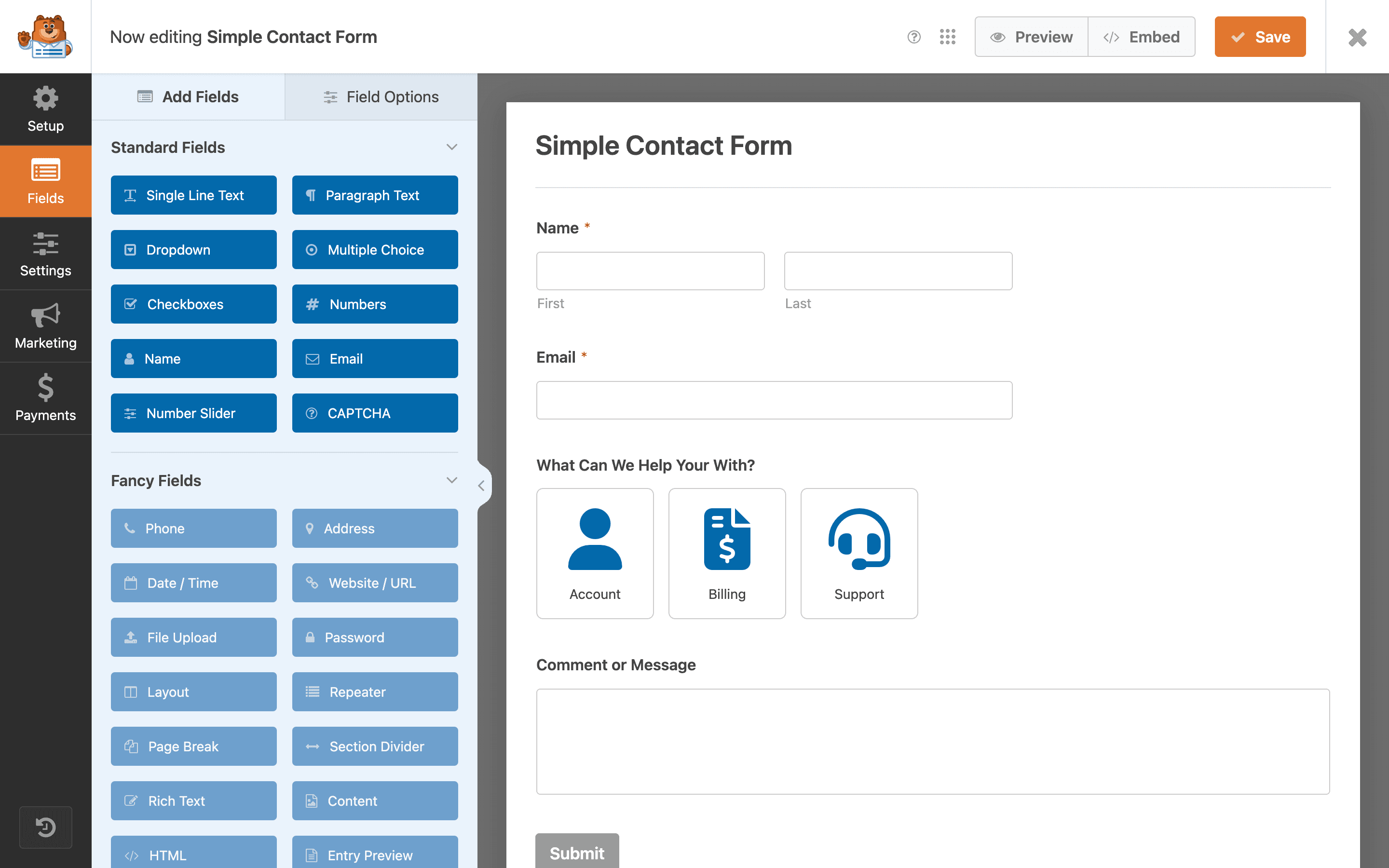
To show what the actual builder experience looks like once you're past the free-tier restriction, here's WPForms' drag-and-drop interface, where step breaks (and every other field type) get added:
The interaction pattern — drag a field type from a panel into a canvas, configure it in a settings sidebar — is close to universal across WordPress form builders at this point, ChargeForms included. What differs plugin to plugin is which of those field types (multi-step breaks among them) are locked behind a paid tier.
A worked example: building a 4-step event registration form
Abstract advice about "grouping related fields" is easier to apply with a concrete example. Here's how a typical event registration form breaks down into four steps:
Step 1 — Attendee info. Name, email, and job title. Kept deliberately short — this is the step most likely to determine whether someone continues at all, so it should take under 20 seconds to complete.
Step 2 — Session preferences. Which track or sessions they want to attend, dietary restrictions, and any accessibility accommodations needed. This step benefits from conditional logic if your event has multiple tracks with different session lists — showing only the sessions relevant to the track someone picked, rather than every session across every track.
Step 3 — Company and billing details. Company name, billing address, and PO number if applicable. This step is naturally heavier and more tedious, which is exactly why it comes third rather than first — by this point, the visitor has already invested two steps of effort and is measurably less likely to abandon here than they would have been on step 1.
Step 4 — Payment and review. Ticket selection, payment fields, and a summary of everything entered so far before final submission. Showing a review summary at this stage — not just a bare payment form — meaningfully reduces submission errors, since it's the visitor's last chance to catch a typo in their email or a wrong session selection.
This structure — easy first, heaviest in the middle, payment/review last — generalizes well beyond event registration. The same shape works for job applications (personal info → work history → documents → review), grant applications (organization info → project narrative → budget → documents), and quote requests (project type → scope details → contact info → review).
Mobile-specific considerations
Multi-step forms are used disproportionately on mobile compared to single-page forms, if only because breaking a form into shorter screens naturally suits a small viewport better than a long scroll. A few mobile-specific details are easy to overlook when testing primarily on desktop:
- Progress bars need to stay visible without eating the viewport. A large, decorative progress bar that pushes the actual form fields below the fold on a phone screen defeats its own purpose — test the progress indicator's actual footprint on a real device, not just a browser resize.
- Next/Back buttons need real tap targets. Anything under roughly 44x44 pixels is genuinely hard to tap accurately on a touchscreen, and a mis-tap that accidentally hits Back instead of Next on a multi-field step is a fast way to frustrate someone into leaving.
- Number and email fields should trigger the right mobile keyboard. This is a basic HTML input-type detail (
type="email",type="tel") that most modern form builders handle automatically, but it's worth spot-checking on an actual phone rather than assuming the builder got it right for every field type. - Auto-advance can help or hurt depending on the field. Automatically moving to the next question after a single-choice answer (radio button, single dropdown) feels fast and modern on mobile; doing the same after a free-text field is disorienting, since visitors often want to review what they typed before moving on.
Tracking and analytics for multi-step forms
One advantage multi-step forms have over single-page forms that rarely gets mentioned: they make it possible to see exactly where visitors are dropping off, not just whether they completed the form or not. A single-page form gives you a binary submitted/not-submitted signal. A multi-step form, if your plugin or analytics setup tracks step-level events, tells you specifically that 80% of visitors reach step 2 but only 35% reach step 3 — which turns "our form isn't converting" into a specific, fixable hypothesis about what's wrong with step 3 in particular.
If your form plugin doesn't natively report step-level completion, this is straightforward to approximate with a generic analytics tool (Google Analytics, Plausible, or similar) by firing a custom event each time a visitor advances to a new step. Even a rough version of this — four events for a four-step form — is usually enough to spot an obvious problem step, like one that's asking for something people weren't expecting (a phone number, a document upload) and bouncing off of it disproportionately compared to the surrounding steps.
Accessibility considerations
Multi-step forms introduce a few accessibility requirements that single-page forms don't need to worry about as much:
- Screen readers need to announce step changes. When a visitor advances from step 2 to step 3, a screen reader user needs some signal that the content changed — usually handled via an ARIA live region announcing something like "Step 3 of 4: Payment Details" when the step transitions.
- Focus management on step change. After clicking Next, keyboard focus should move to the first field of the new step (or to a step heading), not stay wherever it was on the previous step's Next button, which would leave a keyboard-only user disoriented about where they are.
- Back button must actually restore previous answers. A visitor who clicks Back to double-check an earlier field should see their answer still there, not a blank field — this is table stakes for any multi-step implementation but worth explicitly testing, especially after adding conditional logic that might interact unpredictably with the back-navigation state.
Most established WordPress form plugins — ChargeForms included — handle these correctly out of the box, but it's worth a manual keyboard-only and screen-reader pass on any multi-step form handling something important (a paid registration, a job application), since accessibility regressions in custom-styled forms are common and easy to miss in casual visual testing.
Common multi-step form mistakes
A few patterns show up repeatedly in poorly performing multi-step forms, worth checking for before you publish one:
- Too many steps. Splitting a 6-field form into 6 individual steps adds friction without meaningfully reducing perceived form length — group related fields together instead.
- No progress indicator. A multi-step form with no visible progress bar can feel worse than a single long page, because visitors have no idea how much is left.
- Required fields with no per-step validation. If a visitor can advance past step 1 with a required field empty, they'll hit a wall of errors at the final submit — validate as you go, not just at the end.
- Putting the hardest question first. Lead with the easiest 1-2 fields (this is the whole mechanism behind why multi-step forms work) and save harder or more sensitive questions — budget, phone number, detailed project scope — for later steps, once the visitor has already invested time.
- Losing progress on page refresh. Some multi-step implementations reset the entire form if a visitor accidentally refreshes or navigates back — test this specifically, since it's a silent conversion killer that won't show up in casual testing.
Multi-step forms for specific use cases
Grant and funding applications are one of the strongest cases for multi-step forms specifically, since they routinely run 20-40+ fields across organization details, project narrative, budget breakdown, and supporting documentation. Splitting this into logical sections (Organization Info → Project Details → Budget → Documents → Review) turns an intimidating wall of fields into a manageable sequence, and per-step validation catches missing required documents before final submission rather than after.
Event registration benefits from a similar split: attendee details, session or ticket selection, and payment as three distinct steps, with the payment step only appearing after the earlier information is confirmed.
Job applications commonly use resume/document upload as a dedicated final step, so a visitor isn't asked to have their resume ready before they've even decided whether the role matches their background.
Multi-step forms and SEO
A quick note for anyone worried a multi-step form might hurt a landing page's search performance: it doesn't, at least not directly. Google's crawlers evaluate the page a form is embedded on the same way regardless of whether the form itself is single-page or multi-step, since the form's internal step navigation happens client-side after the page has already loaded and been indexed. The actual SEO-relevant factors are the same ones that matter for any page — page load speed, mobile usability, and genuinely useful surrounding content — not the form's step count. If anything, a multi-step form that meaningfully improves conversion rate indirectly helps a landing page's business value even though it has no direct search-ranking effect of its own.
Pre-launch testing checklist
Before publishing a multi-step form for anything that matters (a paid registration, a job application, a grant submission), it's worth running through this checklist once end to end rather than assuming the builder got everything right by default:
- Complete the entire flow yourself, on both desktop and mobile, including deliberately triggering every validation error to confirm the messages are clear and appear on the correct step.
- Click Back at every step and confirm previously entered answers are still there — not reset to blank.
- Refresh the browser mid-form (after step 2, say) and see what happens — some implementations silently lose all progress on an accidental refresh, which is worth knowing about before a real visitor hits it.
- Submit with required fields deliberately left blank on an early step, to confirm the form actually blocks progression rather than letting you reach a later step and only failing at final submit.
- Check the confirmation and notification email to make sure every field submitted correctly, especially any fields controlled by conditional logic — a common bug pattern is a field that displays correctly during the flow but doesn't actually get included in the final submission data.
- Test on a genuinely slow connection (most browser dev tools have a network throttling option) if the form includes file uploads on any step, since a slow upload with no visible progress indicator reads as a broken form to an impatient visitor.
FAQ recap
The short version, if you're deciding right now: if you need multi-step forms without paying anything, your free-tier options are ChargeForms (full support including progress bar) or Fluent Forms (basic support, no progress bar without Pro). Every other major plugin — WPForms, Gravity Forms, Ninja Forms, Formidable Forms — puts multi-step behind a paid plan entirely.
If you're already committed to one of those paid-only plugins for other reasons, multi-step is usually worth the upgrade once your form crosses the 7-field threshold where the conversion data above kicks in. If you're choosing a plugin from scratch and multi-step forms matter to your use case, that's a real point in favor of starting with a plugin that includes it free — see the full ChargeForms feature list and docs for the specifics, or the direct pricing breakdown if you want to compare against what you're currently paying elsewhere.
Frequently asked questions
How do I create a multi-step form in WordPress for free?
ChargeForms includes multi-step forms with a progress bar on its free plan — no paid upgrade required. Fluent Forms' free plan includes basic multi-step support too, though the progress-bar UI and per-step conditional logic need Pro. WPForms and Gravity Forms both require a paid plan before you can build a multi-step form at all.
Do multi-step forms actually convert better than single-page forms?
Yes, consistently, once a form has more than about 6-7 fields. Formstack's data shows multi-step forms averaging a 13.85% conversion rate versus 4.53% for single-page equivalents on comparable forms -- roughly 3x. Below that field count, the difference shrinks and a well-designed single-page form can perform just as well.
What's the difference between a multi-step form and a multi-page form?
In practice, nothing -- "multi-step" and "multi-page" are used interchangeably in WordPress form plugin documentation. Both describe splitting one form's fields across multiple screens with a Next/Back flow, usually with a progress indicator, instead of showing every field on one long page.
Can I add conditional logic to skip entire steps in a multi-step form?
Depends on the plugin. ChargeForms and Fluent Forms Pro both support conditionally skipping an entire step based on an earlier answer. WPForms' step logic is more limited -- you can conditionally show/hide individual fields within a step, but skipping a whole step based on a prior answer isn't natively supported the same way.
How many steps should a multi-step form have?
Most conversion data points to 3-5 steps as the sweet spot. Fewer than 3 steps often isn't worth the extra clicks compared to a single page; more than 5-6 steps starts reintroducing the abandonment problem multi-step forms are meant to solve, just spread across more screens instead of one long one.
Related posts
Contact Form 7 Is in Maintenance Mode: What That Actually Means
Contact Form 7's creator confirmed at WordCamp Asia 2026 that version 6.2 is the last feature release — the plugin now gets security patches only. Here's what changes, what doesn't, and what to actually do about it.